Typography And Its Importance
Typography was earlier presumed to be just a phase in web design which could be either used or overlooked depending on the time available to complete a website. Without being aware of its importance, the designers designing the website were using any typeface and alignment format which they felt to be appealing. But lately, typography has been identified as a standard system which acts as a balance between the visual graphics of the web page and the verbal content that is displayed.It has been observed that as a reader, all that one notices first in a website is the visual graphics. Later, with the same tone of insight, the reader starts reading thecontent that basically aims at explaining to him / her more about the service or the product that the website deals with. In this case, researches have proved the essentiality of having typography in line with the graphical design of the website. Again, the difference between the display quality of a content displayed in a web page and in a conventional magazine is that the limitations that are noticed in the case of web pages are much higher than those in conventional pages.The most important point that one has to remember while selecting the typeface for the websites is that it is not guaranteed that the same font that is selected and used in the website would be displayed on the reader’s screen. This depends on the availability of the same font in the reader’s system and the process is long and requires the involvement of the web browser, web server and the operating system used by the reader. With the various limitations in mind, it is always advisable to use ‘Arial’ or ‘Times New Roman’ or ‘Verdana’ or any other generic typefaces which we are sure would be available in the reader’s system as well. Other rare stylish fonts can be used and converted to .jpeg files before being placed in the website in case there should be a need for the use of the font in the website. The size of the system display monitor is another factor that needs to be considered.Above all, legibility of the text that is displayed is very important as the main purpose of having the text is that it should be read and understood by the readers. And perhaps, only legible text could motivate any reader to read further. The various text blocks are to be partitioned and aligned appropriately along with proper highlight for headlines and sub-titles. The line spacing between any two lines should also be appropriately set depending on the font size. This is to be considered as a very essential and crucial point as too much space (or white gap) between the sentences would confuse the reader making it difficult for him / her difficult to find the start of the next line. Closely packed lines cluster the whole text.Though these are minor points, but when attended to carefully they would make a lot of difference in improving the standard of the website. XEL Web Design adheres and pays attention to each and every minor factor that contributes to the betterment of a design. This can also be mentioned as one of our strengths and the secret of our success.

Typography is one of the visual elements that can be used to create great web design. And the importance of good web typography is proportionate to that of good web design.
Good typography helps to establish good visual hierarchy, leading the reader across the page in accordance to the level of importance of the different text and images. It can also provide visual punctuation and graphic accents to help readers to connect text with images, and headlines with content.
Visual structure essentially consists of the following elements; image, type and colours. In order to create a good design, designers must understand the relation of these elements with each other so that they will make good artistic choices that are complimentary, working together instead of in opposition.
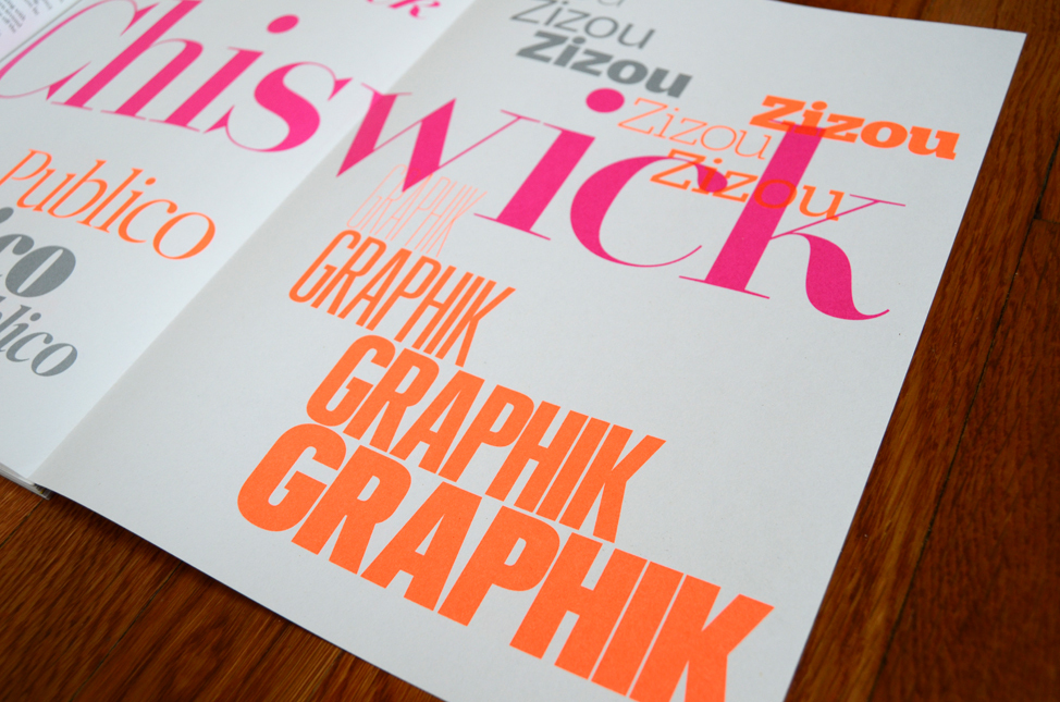
Simple and Strong Typography
Simplicity is very effective in design, but to create a good simple design is no easy task. To ensure readability, it is best to use 15 words or less for headlines. White type against a black background also increases readability due to its high contrast. Using a strong bright colour gives emphasis to a headline while a more subtle colour for the rest of the text can help accentuate the headline as well.
Minimalist web designs like the one shown below also allows the typography to stand out and draw attention to its content.
The Typeface
In typography, a typeface is the visual representation or interpretation of a set of characters; it is their appearance. Each typeface is designed, and there are thousands of different typefaces in existence, with new ones being developed constantly.
The art and craft of designing typefaces is called type design. Designers of typefaces are called type designers. In digital typography, type designers are sometimes also called font developers or font designers.
Typeface is the design of glyphs which is the looks of characters. The same glyph may be used for characters from different scripts, e.g. Roman uppercase A looks the same as Cyrillic uppercase А and Greek uppercase alpha, and there are typefaces tailored for special applications, such as map-making or astrology and mathematics.
The term typeface is frequently confused with term font or used as a synonym. Before the advent of digital typography anddesktop publishing the two terms had a more clearly understood meaning.
The type families consist of Romans, Sans Serif, Slab Serifs, Scripts, Decorative Style.
Then there is also the Digital typefaces as in Georgia, Verdana.
And of course there is the strong typography, the headings, the optical letter-spacing, subheadings, new paragraph, and finally individual words and characters.

No comments:
Post a Comment